
At some point during the sketching phase of the 7th episode of Gearing Up, my comic collaboration with SciFi & Fantasy author J.S. Morin, my concept for how to convey the warehouse our robot adventurers would be pillaging morphed into a wimmelbilder. Honestly, it probably happened the moment I decided to go isometric with the scene, but I can’t say for sure at what point I decided it was a brilliant plan. (Spoiler alert, it was NOT a brilliant plan.)
Granted, I’m thrilled with how it turned out, and I did have a lot of fun with it, but it was also a lot more work than an episode of a webcomic should be. For context, most of the episodes have taken me a couple weeks to finish, usually spending 2-3 hours at a time every few days. Best guess, around 20-25 hours of work. This one took me a solid month, some days spending upwards of 4-6 hours. I don’t track my artwork time manually, since I’m not working for clients, but my ScreenTime stats show around 75 hours in Procreate for August, exclusively on this one piece of art.
Since I went through all of that work, and there are so few tutorials on the web about how to plan and create wimmelbilder artwork, I thought I’d share my key lessons learned.
Keep in mind, I’m not a wimmelbilder artist. I barely feel qualified to call myself a comic artist, at this early point in my journey. Hence the moniker n00b KoMics. So don’t expect any kind of definitive guide. Take it for what it is: my takeaways and observations from creating my first wimmelbilder.
Lesson 0: What’s a ‘wimmelbilder’?
Wimmelbilder is a German word that translates as “teeming picture” (the German language has some of the best words!), and describes artwork full of tiny details that reward the viewer for looking closely. Common examples are Where’s Waldo books and illustrations in the children’s magazine Highlights. You can also find lots of wimmelbilder-based jigsaw puzzles.
Lesson 1: Do it on purpose
Yes, I had fun. Yes, I’m proud of the outcome. But goodness gracious, do I wish I’d saved my first wimmelbilder project for something intentionally-planned as such, rather than stumbling into it while working on a comic episode.
Caveat: Would I have ever felt “ready” to tackle a project this complex this early in my “getting back into art” journey? Maybe not. Maybe doing it by accident was what I needed to commit to it. Maybe you need serendipity on your side too...
Lesson 2: Establish the framework
The framework comes directly from your premise for the art piece. What’s your wimmelbilder setting? It should be evocative of lots of little fragments of stories, or one larger story with multiple components. It should suggest what kind of characters and objects will populate the setting. This is where all those delightful little details are going to come in.
Is it a haunted mansion? A fan-art version of Blade Runner’s San Francisco? A playground for your original characters to show off their unique personalities?
In my case, I had the framework set for me by the comic’s script. Our robot adventurers are picking over a warehouse that’s largely been depleted by looters. That gives me a couple key pieces to start from.
A) We’re in a warehouse in a factory. Warehouse means lots of shelves. Factory means the warehouse has stuff either produced BY the factory or consumed by the manufacturing process and its (long disappeared) workers.
B) Looters, specifically previous robot adventurers seeking treasure, loot, and glory in the depths of the factory, have been here before. It’s been mostly picked over. So whatever objects remain should have been left behind for a reason. Was it hidden, and previous looters overlooked it somehow? Is it, at least on the surface, useless or unappealing?
Those sorts of questions help me plan, using my framework as the guiding principle.
Lesson 2a: Isometric grid is your friend
I’m not willing to declare that all wimmelbilder artwork is isometric. I’ve seen some classical artwork that follows the general principles of a “teeming picture” that brings tons of tiny elements into an impressive composition. I’ve seen maps that are more illustration than just geographic features. But if you’re aiming for your first, isometric perspective can make planning a LOT easier. You get to, mostly, ignore issues of perspective.
That said, isometric art can introduce some odd challenges. Many scenes, especially in open places, lend themselves well to simply allowing the scene to spill off the edge of your canvas. The mystery of what's happening just outside the frame can even lend intrigue to your art. However, portraying interiors might end up with some awkward corners. You'll want to think about how to deal with them during the planning stage, but we'll talk more about them later.
Lesson 3: Build your underlying structure
If your setting is a city, this might be city streets and buildings. If your setting is the aforementioned haunted mansion, you’ll need to decide on your floorplan and rough layout of rooms within the floorplan.
As I already mentioned, my underlying structure was shelving. Lots of shelving. And any big equipment—like huge consoles or a stray forklift—left hanging around the warehouse.
Ideally, the underlying structure will conform to the isometric grid. Using procreate? This is great time to turn on your isometric grid and drawing assist.
Power tip: Underlying structure provides the foundation for unique elements and details. But it can be relatively uniform. So pick a few key distinct framework pieces and rely heavily on copy and paste. A few key building archetypes. A couple different types of shelf layouts. Mostly square rooms. Then sprinkle in uniqueness where you want something to stand out, like your protagonist’s house or my surveillance console.

Lesson 4: Block in zones for details
Before you try to start sketching details, wrap your head around the major zones in your composition. I collaborate with a scifi & fantasy writer who’s a kick-ass worldbuilder, so I asked him to help me worldbuild things like fake brands, and we worked together to determine what kinds of items would catch the eye of each of our characters as they explore the warehouse. Note, the below image is from much later in the process, because we had to revisit notes that were too vague at first. So this can be an iterative process.
If your wimmelbilder is Super Mario fan art, for example, your zones of details will correlate to your underlying structure matching enemies and atmospheric elements to game zones. You don’t need to know that you’ll have a transport tube here or a fireflower there, you just need to know that your desert zone will have cacti and pyramids.

Lesson 5: Draw complete objects
In finished art, objects exist in space, and naturally some objects obscure other objects behind them. (Wow, THAT was a mouthful! Can vowel sounds even be alliterative?) But before you move from planning to sketching, be prepared to draw complete objects. Worry about clipping this box, that planter, this table, that car, this mushroom tree, or that shelf behind objects that fall in front of them later.
NOTE: Don’t worry! Tips for making this work, especially if you’ve got limited layers available in Procreate, coming later.
Why? Because intact objects can move around easily. Planning can only get you so far. Eventually, you’ll start drawing and you’ll discover you missed something. Or you came up with a delightful detail you just have to add in. You’ll want the flexibility to let the natural discovery that occurs during artwork creation unfold.
In my case, since my project was fundamentally a comic episode, I determined the location of my characters and their speech bubbles first. Then I hid those layers to keep them from distracting me (or preventing me from creating complete objects). I can’t even tell you how many times I realized the delightful detail I’d added would be completely hidden behind my speech bubbles. But because I drew complete objects, I was able to lasso them and move them to a different shelf where the viewer could discover them.
Lesson 6: Draw exemplars
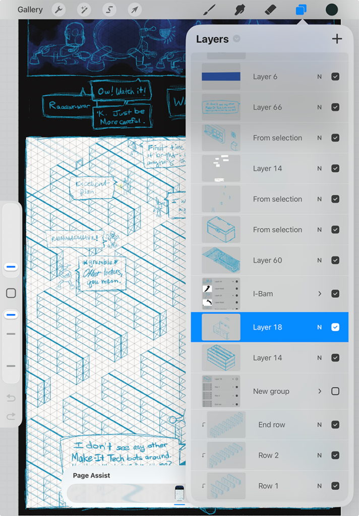
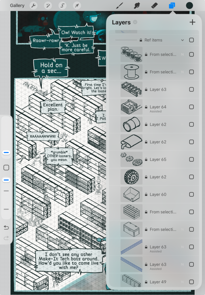
During both the sketching phase and at the linework phase, you’ll want to borrow a page from your structure playbook and draw exemplars that you can copy and paste generously. Assuming your artwork lends itself to “lots of a given type of object” (and my condolences to you if it does not), you’ll want to build a library of object exemplars that you can either duplicate or use as a starting point for creating multiple versions of those objects.
Cars, cabs, hoverbikes, delivery trucks, trees, different trees, green pipe tubes, street food carts, rickshaws, bicycles, fire hydrants, parking meters, tables, windows, chairs, lamps, candlesticks, cobwebs, puddles, forest critters, flowers, waterfalls, even generic background characters.
In my case, I had lots of boxes, trunks, storage bins, buckets, cans, more trunks, oil canisters, cans of paint, and more trunks. In addition to my 2 main shelving exemplars. I learned early on that I’d need an unaltered version for a new area over and over again.
Take full advantage of your isometric grid, where possible, your drawing assist feature to conform to that grid, as you build this reusable library.
Lesson 6a: Save your exemplars
Especially if you’re working with a finite layer count in Procreate, but even if you simply need to simplify your layers in Photoshop, you might find yourself merging layers of your copied and pasted exemplars. And that’s perfectly fine. You gotta do what you gotta do.
But save yourself a folder or group of your exemplar sketches, and eventually your exemplar linework, each on its own layer. Trust me, they will come to your rescue when you missed one, accidentally clipped one incorrectly, or discovered the perfect opportunity to use one in a new location later.
If you run out of layers, you can always duplicate your file and delete these in the new version, keeping the exemplar layers in the archived document. Make sure to label the archive file so you can always find them easily when you need them!
And if you end up deciding to create more artwork in a similar setting—this scene in a different season, a neighboring town, a similar house—you might eventually want to create stamps or brushes from these saved objects.
Lesson 6b: Twist your exemplars
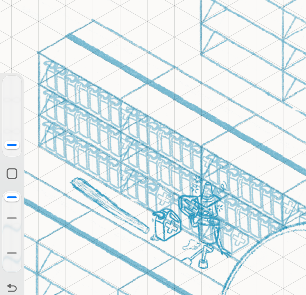
Including areas with large collections of the same, or similar, objects can be a huge win for productivity during your artwork creation, especially if you’re not willing to spend months drawing the same object over and over again dozens of times or more. (For obvious reasons, I wasn’t.) But you still want to balance that with breaking up the sameness by twisting those exemplars within these large groups and drawing unique instances individually.
This step can provide a middle ground between leveraging time-saving reusable items and the truly unique objects that tell the key moments of your story.
Line of bicycles on the street? Knock one on its side or have one in the clutches of a bike thief. Traffic jam of reused vehicles? Have two colliding and show them both damaged. Park full of similar trees? Have a branch bending lightly because of a kid riding a tire swing. Find ways to break up the monotony and use these as excuses to introduce the delightful kinds of details that make wimmelbilders such a special form of artwork.
My biggest twisted exemplar example (I just can't help myself!) came when I realized that, in episode 1 of Gearing Up, we established that oil was a "drink at the pub" thing for our robot civilization. So why would there be so many full oil canisters on the shelves, rather than pillaged by looters? Once I realized that most would be empty, I also realized that most wouldn't be standing neatly upright in rows on shelves. Essentially throwing out my initial sketch to knock them over and strew them around was time-consuming, but it fit the story world far better.
But simpler changes helped bring the image to life, too. A missing anchovy tin from an otherwise uniform stack. Loose antennae next to jumbled bins of them to better showcase the unique shapes. One crate turned sideways amid forward-facing crates. A shelf of records instead of books. Little details that draw the eye and make the world feel lived-in.

Lesson 7: Limit the color palette
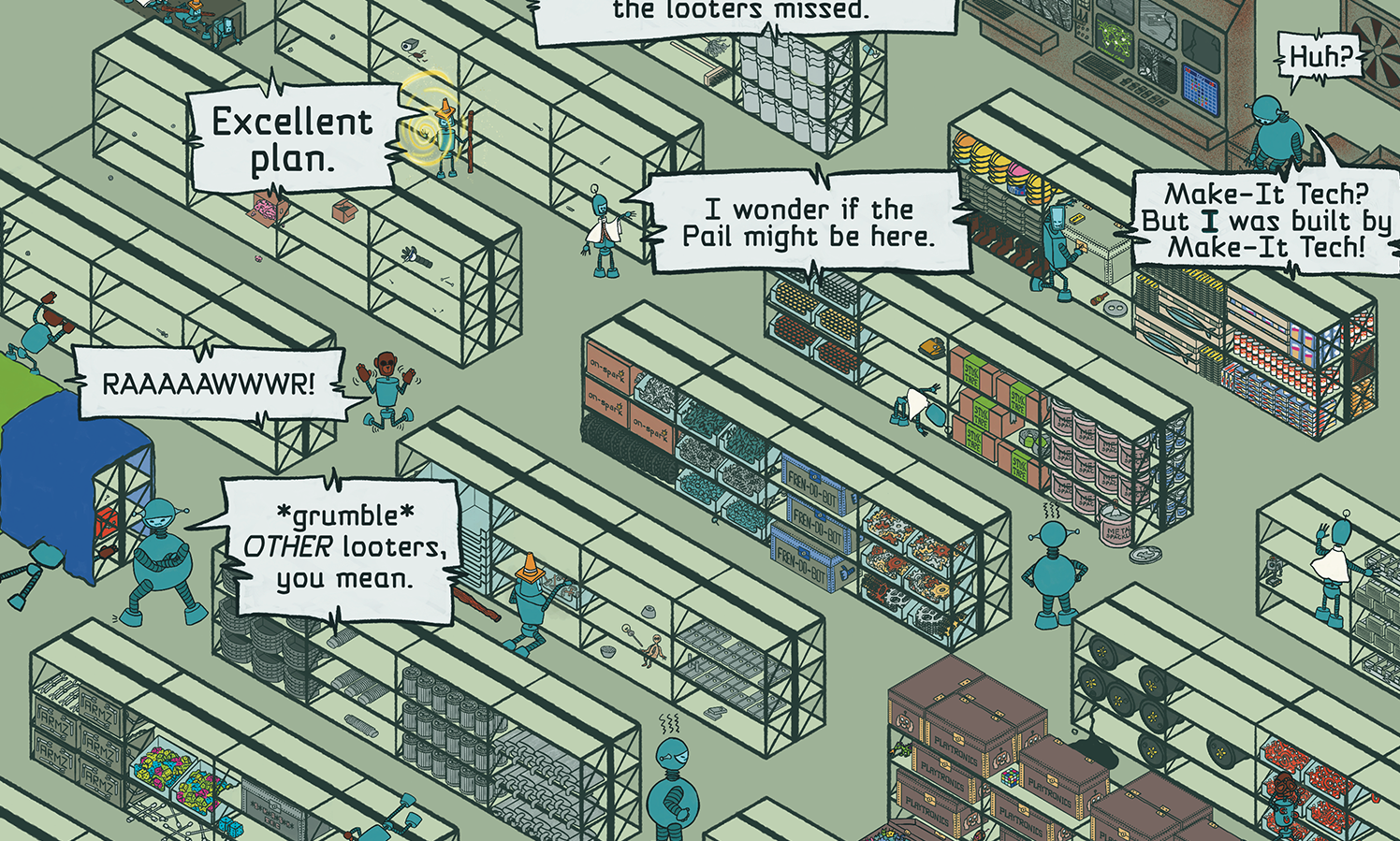
Fair warning, I did a TERRIBLE job of this in my comic wimmelbilder. My comic already uses a limited palette, but I was far too reckless with my “use on rare occasions” accent colors. Especially in sections like my bookshelves.
I started the coloring process with all kinds of intention and care, choosing shelves of stuff that I wanted to recede into the background and using colors with values similar or identical to my background.
And then, maybe around halfway into the color process, all that intent went out the window. If there were a piece for sale, as a poster or something, I’d go back in and be more careful about this. But because this is a comic, and this episode is already overdue, the result is what it is. It’s more visually “busy” than I’d like, but it’s a complete comic, and a fun wimmelbilder.
So I take my lesson and carry it forward with me into my next wimmelbilder project. (Yes, I've had my next one percolating in my brain since about halfway through working on this one!)
NOTE: It is, to a certain degree, normal for wimmelbilder scenes to BE busy. It’s part of the nature of artwork teeming with details. But color-based busy-ness should be used intentionally to guide the eye to important elements of the overarching story to obscure secrets or surprises you want users to struggle to find. For an absolute master of the limited palette approach in wimmelbilder artwork, check out Nigel Sussman’s website. He's done some illustration for J.S. Morin's Black Ocean series before, and was kind enough to let us share the "behind the scenes" wimmelbilder process, from a client perspective. We just LOVE his style.
Lesson 7a: Use the grayscale trick to diagnose contrast issues often
A great way to diagnose contrast issues in artwork, especially in a wimmelbilder, is to grayscale your artwork early and often and see where your eye travels naturally in the absence of color hues.
Photoshop tip: Keep everything in a top-level folder and apply a Black & White adjustment layer to that folder. Then toggle the visibility off once you’ve checked for any issues.

Procreate tip: Create a layer at the top of your artwork in any shade of gray along the spectrum from black to white. Set the blend mode to “color”. Toggle the visibility of the layer off once you’ve checked for issues. This layer earns its keep, so try not to delete it when you need to free up space.

Lesson 8: Tell your story with unique moments
Creating your unique moments and objects that contribute most to the visual story you want viewers taking away from your artwork. Key characters performing key actions with key props. Action-in-progress moments.
Is your haunted mansion really a humorous monster mash party? These are the funny elements that keep things lighthearted rather than scary. The ghost flying through the punch bowl that freezes. The vampire biting a red velvet pillow shaped like a drop of blood. The spider getting caught in its own web.
These are the items that it’s worth stepping outside your isometric grid for. Spend the most time on these. They will make or break the story told in your artwork.
In my factory, the fundamental story is: robots exploring a warehouse for anything (previous) looters overlooked. And despite being critical of his team for doing the same as all the previous looters, one robot storms off to sit on a crate, only to discover it contains what the script describes as “the prettiest goshdarn hammer you’ve ever seen”. Hypocrite! But also, embrace the looting! This is what dungeon-crawling adventures are FOR.
My biggest challenge came from telling a story of a comprehensive search with only 5 characters in an enormous warehouse. I solved this problem by reusing characters multiple times and letting viewers puzzle out the path the robots might each have taken exploring the giant room. And, in doing so, J.S. Morin and I discovered a lot about our characters’ personalities.
Because episode 7 is still relatively early in their journey, we needed to decide what types of objects would interest each robot. What would catch their eye? What would get them in trouble? What might they find that we could see them use in future episodes?
Lesson 9: Reward viewers who spend the most time
Ok, this is where the real fun comes in. If you don’t love this part, then creating wimmelbilder artwork probably isn’t up your alley. This is where you go beyond the essence of your story and add in details that give viewers something more.
The heartbreaking truth, and the reason that I state this was not a brilliant idea, is that most followers of Gearing Up will view this episode for a minute or two on Webtoons, just like all the rest. They’ll read the dialogue and be done with the comic until the next episode hits.
But some will want to engage with the details. They’ll visit the Discord group, download the PDF, and appreciate all the little details. They’ll try to find the homages and references I’ve included. And those folks are a wimmelbilder’s most important audience.
Those are the people we include even more details for. Plus, you know, for ourselves!
Easter eggs & Homages. References to popular culture or real-world events, memes, and more. Things that sharp-eyed viewers can feel proud of finding and recognizing. Chances are no one will recognize all of them, but maybe you dangle a “things to find” key, preferably spoiler-free, to challenge viewers to find as many as possible and give them a target to aim for. The Gearing Up factory warehouse includes references to movies, TV shows, music, video games, J.S. Morin’s other books, and stereotypes of apocalyptic settings (including the subversion of one)—all in varying degrees of subtlety.
Callbacks & Foreshadowing. Admittedly, these are storytelling devices that are more relevant for artwork in a comic. But if you’ve been creating artwork for a long time, or have recognizable cast of original characters, including these in your wimmelbilder can make for fun callbacks for long-term fans. Similarly, foreshadowing upcoming artwork can help build excitement for the next thing you release.
Separate from the easter eggs for other people’s media and products, the warehouse includes several callbacks to elements from previous episodes, and one teaser for an upcoming episode’s main combat encounter.
Lesson 10: Work as large as you can
This all comes down to computing resources. How big can your file be in Photoshop before you grind your computer to a halt? How big can you make your canvas in Procreate before you don't have enough layers to stay organized? Creating art in Procreate, especially if you can't afford the top-of-the-line iPad (I didn't splurge because I needed to prove to myself I'd actually use it), is a constant battle for more layers. And eventually, the layers you need just can't keep up with the canvas you want. I get it.
But my template for comics is double the pixel-width (and height) of the required size for Webtoons. At that size, I usually have the layers I need to prep my panels, even if they're distributed across 2-3 pages, and keep a high-resolution copy in case readers some day demand a printed edition.
But a wimmelbilder is a whole new ballgame. Creating the tiny details, even zoomed in, often left my brushes pixelated and frustrating. If I were planning another piece of art this complex, I'd definitely work with a bigger canvas, even if it meant more versioned files and more compromises on unique layers.
Lesson 11: Limiting layers/groups the smart way
Even if your drawing program of choice supports unlimited layers, like Photoshop, you’ll thank yourself for keeping organized layers when creating a complicated piece of artwork like a wimmelbilder.
Working on Procreate, with limited layers, these were kind of bare minimum unique layers that left me the flexibility to move things around and layer as needed. In other software, these might be useful as folders of layers.
Key groupings I found particularly useful:
- Characters & the objects they’re directly interacting with
- Groups of objects on shelves
- Shelves
- Room structure/outline
For each of these groupings, I had—at a minimum—a single layer for linework and a single layer for color fills. I also had a random smattering of unique objects that had their own layers so they could move around and appear on top of other objects.
And because my wimmelbilder was also a comic, I ended up with these additional layers:
- Other panel artwork
- Text bubble outlines
- Dialogue text
- Text bubble fills
I managed to keep text as text, rather than rasterizing and flattening, but it required 14 total layers, including the bubbles and their outlines.
I preserved layers for the other 2 panels in earlier copies of my file, since I locked in that artwork before starting the details of my wimmelbilder in the main panel.
Lesson 11a: Mask, mask, mask
Ok, remember the whole “draw complete objects” tip? This is where you make that work. Whether you’re maintaining a handful of robust layers of outlines or simply grouping layers in folders to keep your workspace manageable, I found that masking at the group level balanced minimizing layers in Procreate (masks count as separate layers from the layer they mask) with having enough granular control to position objects in foreground/background relative to each other as needed.
Because of the logistics of isometric shelving, I couldn’t simply position everything in the right relative layering to clip my full objects as needed. So masking allowed me to easily obscure objects by the shelf above and hide vertical shelving support bars by objects on shelves.
I mean, I say “easily”, but it does take time. It’s part of the balancing act artists constantly manage when dealing with complicated artwork in Procreate. But I still found this complexity worth the effort when I got something wrong or needed to move an object to a different shelf. The non-destructive nature of masks saved me a lot of redrawing and frustration.
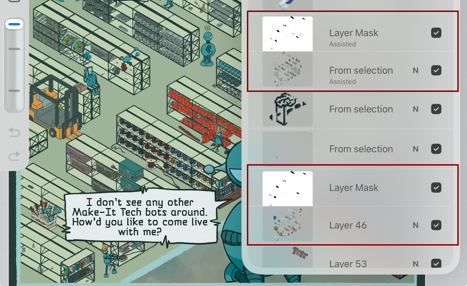
Lesson 11b: Color after you mask your linework
No promises that you won’t need masks ON your color layers. But if you spend your time and diligence on getting the masks on your linework layers as accurate and complete as possible, you’ll find you need to mask colored objects less often than not. After all, if you’ve preserved the linework for your whole objects, flat coloring especially is straightforward enough, even if it’s still time-consuming.
Lesson 12: Keep your little items simple
Wimmelbilders are complex in aggregate. But your characters and items are, relative to the whole piece, tiny. Digital tools allow us to zoom way in and put all our usual details into tiny object. But resist the urge. All those details will get lost, and possibly even make your most important objects muddy or confusing. You can still achieve a ton of personality working with very little detail. Wimmelbilders force us to learn to simplify, simplify, simplify. Channel the sentiment commonly attributed to Einstein. "Everything should be made a simple as possible, but not simpler."
Lesson 12a: Simplify your textures, shadows, and highlights
Wimmelbilder artwork is already complex. Even if you traditionally include elaborate texture, shadow, and highlighting in your pieces, consider simplifying. And the objects you’ve created and populated your story with are, relatively speaking, tiny. Overloading them with too many embellishments risks muddying the details beyond recognition and exacerbating the visual complexity.
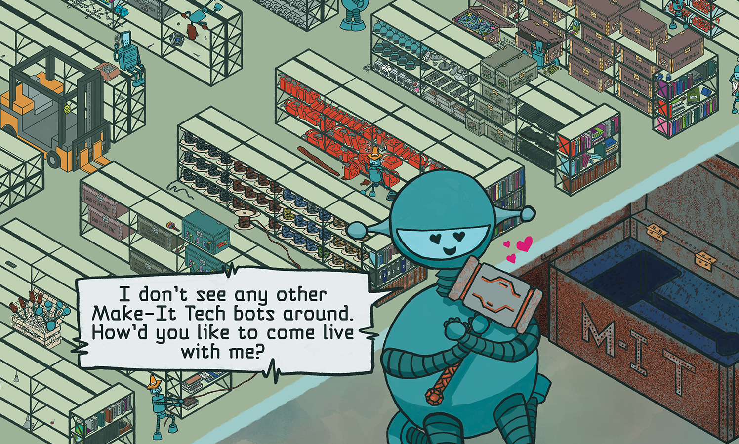
Gearing Up comics already use a simplistic form of shadows, and minimal highlights, but I use them diligently and consistently in standard panels. And I introduce textures and special effects where objects have large areas of otherwise flat color to add some visual interest.
But in my warehouse, I mostly stuck to flat colors to help tame the “busy”. Note the difference in shadow treatment between the tiny bots and the big bot panel at the bottom.
Lesson 13: Fill your awkward corners
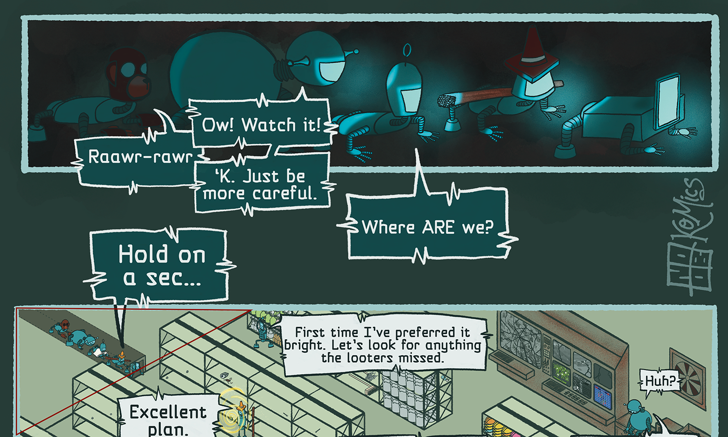
As huge as my warehouse scene is, I wasn't willing to zoom in far enough to eliminate the issue of the angled walls that result naturally from drawing a rectangular room with an isometric perspective. That just wouldn't have had the scale I wanted. So I ended up with awkward corners at the top and bottom of my artwork.
Because my wimmelbilder is also a comic, I used the bottom one as a non-traditional panel, and gave my skeptical robot a moment to appreciate his found treasure, but also to include the kind of details that just wouldn't work at a tiny scale. But that still left me with a couple awkward triangles of space at the top. I'd already decided on some old factory consoles for the righthand corner, but what do to with the one on the left? In the end, I simply allowed a little "back wall of the warehouse" space, and took the opportunity to reframe the "crawling through an awkward corridor" from the panel. I'd already committed to my characters appearing multiple times each in the scene, so it was a natural solution that fit the rules of the scene, rather than simply leaving dead space.
Clever solutions like this can enhance, rather than detract from, your finished artwork, but it will require some planning. Do you zoom out further and place your entire isometric haunted mansion in a decorative exterior? Don't necessarily feel like you need to continue the isometric perspective outside of your main area of focus with your tiny characters and objects. Sometimes those awkward corners and borders are an opportunity to enhance with artwork that feels more like your regular fare.
Lesson 14: Track progress
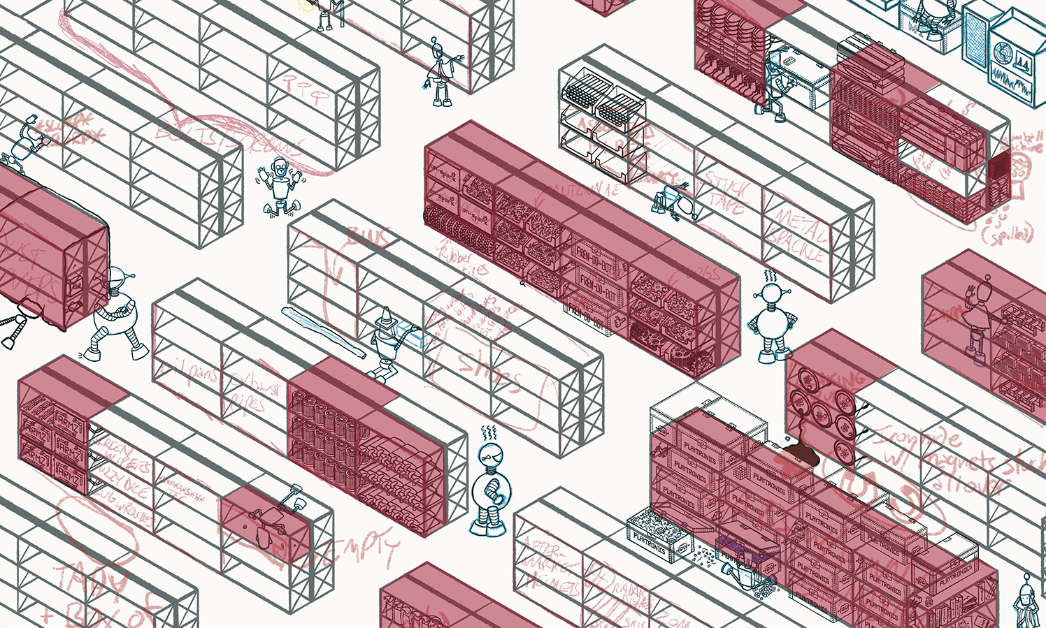
For me, this was a sanity thing. As I completed shelves of items, I filled the the area with red on a semi-transparent layer as a visual "this is done" indicator. As I made progress, I got to see the screen fill up with red. Maybe I should have chosen a friendlier color, but even in the color of "angry", this trick managed to give me a sense of growing accomplishment.
Lesson 15: Allow yourself to declare it “done”
Especially if you’re having fun sprinkling in little easter eggs and other details, it can be easy to get stuck in “just a couple more things” mode. I can also easily see how the meticulous nature of wimmelbilders might attract artists with a particularly strong tendency towards perfectionism.
Absolutely do a thorough QA to make sure your items overlap properly—even get a second set of eyeballs, if you can. Make sure you’ve included all necessary elements of the story and key details, if you’re doing a project for a client. Don’t miss contractually obligated requirements or legit mistakes.
But eventually, you need to call it “done” and share it with the world. Don’t use more things you could do as an excuse to keep tinkering forever.
Do I still have empty shelves that could have more signs of debris and hint at what used to be there? Absolutely! Do I wish I could sneak in one more “cool robot” homage to delight viewers? Of course. But other artwork is waiting behind this project, and it deserves to find its way into the world too.
Bonus Takeaway: Wimmelbilders (and comics) in an age of GenAI
Let’s be brutally, painfully, heartbreakingly honest. No matter how long you’ve been making art, no matter how uniquely “you” your style is, nowadays artists get accused of using generative artificial intelligence to create art. It’s a tragedy, but it’s true. Even when it's obvious to anyone who's ever toiled lovingly over a project for days, weeks, or months (sometimes more) that the accusation is complete bunk.
But wimmelbilders and comics still share the unique characteristic of being (at the time of this writing) impossible for GenAI to create. For wimmelbilders, disparate details coming together to tell a cohesive story is something that’s still far too complex for GenAI. And GenAI still struggles with tiny details of any kind. For comics, GenAI still can’t manage consistent characters across multiple illustrations.
So theoretically, both types of artwork should be able to break through the accusations with greater ease. It doesn’t make it right, but it’s a compelling excuse to try dabbling with one or the other, if you haven’t yet.
Last step: Share your own tips!
I took the time to (digitally) pen my thoughts and takeaways from my own process because I found so few tutorials for creating wimmelbilder art online. If you try creating your own ‘teeming picture’ artwork, or if you’re an experienced wimmelbilder artist, share your experience with the world! Even quick power tips from experienced artists can help give budding artists the confidence to experiment with this amazing art form.
Resources
Reddit Wimmelbilder - My favorite time-sink. Browsing all the amazing artwork beats doom-scrolling any day!
Nigel Sussman - There are hundreds or thousands of talented wimmelbilder artists out there. But I did mention Nigel Sussman as a masterful example, particularly with his use of limited color palettes.
Mamei Wimmelbild & Illustration - I don’t speak German, so I didn’t even turn on sound, but this guy shares process videos for his wimmelbilder artwork. Too short to be actual “tutorials”, but it’s a good way to get a feel for how the process can go.
Search-and-Find Illustration in Procreate - I also don’t speak Portuguese, and haven’t been willing to balance reading subtitles with trying to draw, so I haven't tried it, but this Domestika course for “Search and Find” illustrations covers wimmelbilders without using the specific term. Not endorsing, just sharing its existence. YMMV (Careful, it’s easy to accidentally end up subscribed to Domestika.)
Holly Carden's Process posts - A wimmelbilder artist (you might have seen her stuff in puzzles!) shares her process.
Laura McKenzie Atkins' process - A highly simplified overview of the wimmelbilder process, probably to set expectations on the amount of work with potential clients. Note that she does a lot of detailed shading. Many of her pieces stop at black and white, so shading provides her work a much-needed depth.
Art with Flo "Rooms" - If you're looking to start small as a means of practicing wimmelbilder-style illustrations, lots of online tutorial artists on YouTube do little isometric rooms with wimmelbilder flair, scaled down. "Art with Flo" has a bunch: just use the "Rooms" filter in her full tutorial list. Some are Patreon-exclusive, but a bunch are free on YouTube. I had a TON of fun modifying her "Isometric Gaming Room" YouTube tutorial with my own geeky details.
Gearing Up Web Comic - If you’re interested in catching up on the 6 episodes leading up to this crazy scene, check out Gearing Up on Webtoon.
J.S. Morin - The SciFi & Fantasy author behind Gearing Up's words. Links to his books, blog, webstore (including Gearing Up merch!), socials (including a lively Discord group!), and more.